
-
In the well-established visualization of ancient Hebrew cosmology, based on the Genesis account of creation in the Torah, the earth is an oblate spheroid.
So why does Wikipedia erroneously – and frankly, sneeringly, state that “The ancient Israelites envisaged the universe as a flat disc-shaped Earth floating on water.”?
Again, in the same article, Wikipedia states that “The cosmology of the ancient Near East (including Mesopotamia, Egypt, Persia / Iran, the Levant / Syria, Anatolia / Turkey, and the Arabian Peninsula…included a flat earth, deliberately misleading the reader away from the obvious presentation as an oblate spheroid, which is a flattened earth.

-

-
-
To correct these distortions, Tokyo-based architect and artist Hajime Narukawa created the AuthaGraph map using a complex process that essentially amounts to taking the globe and flattening it out.
-
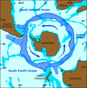
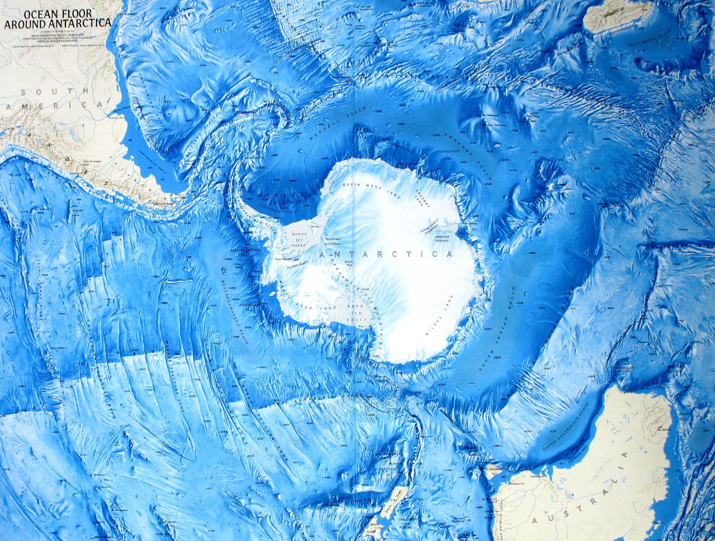
The politics of this – firstly- rectangular map really comes into play in the map’s configuration failure to place Antarctica in its central place in the ocean’s circulation.
This may be the most accurate map so far, but still deceptive.
Deception #1 – Hiding Antarctic’s Key Position On Earth
-

-
-
The Antarctic holds 70 percent of earth’s fresh water which, consistent with the earth becoming formless and void under a great deep (Genesis 1:20), has been scientifically determined to have come from water-carrying bodies in the early solar system that collided with earth.
-
“He gathereth the waters of the sea together as an heap: he layeth up the depth in storehouses…treasures of the snow…the treasures of the hail, Which I have reserved against the time of trouble, against the day of battle and war… (Psalm 33:6-8, Job 38:22-23)
-
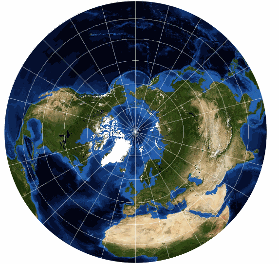
Deception #3 – Reporting The Antarctic In The South As Equal In Size To The Arctic In The North
The most deceptive tactic of all is that when we compare the Arctic region to the Antarctic, we see that maps typically attribute about the same geographical area to each, indicated as white polar regions.

-
But they aren’t.
-
“Antarctica” defines a continental landmass continent measuring 5.5 million square miles.
The Arctic “Zone” is measured at 5.5 million square miles, by using temperature as the criteria to include the frozen Arctic Ocean surrounding the magnetic North Pole plus landmass of Greenland at 836,330 sq mi), Spitsbergen (14,546 sq m) and the northern parts of Alaska, Canada, Norway, and Russia.
However, due to seasonal temperature changes, the size of “the Arctic” changes dramatically throughout the year, reduced in half from about 5.5 to only about 2.5 million square miles at the end of the northern summer.
If we use the same criteria to accurately compare “the Arctic Zone” and “the Antarctic Zone” by including Antarctica’s surrounding sea’s solid surface of sea ice, “the Antarctic Zone” roughly doubles to 11 million square miles, making “the Antarctic” six times the size of “the Arctic” and the third largest continent in size after Asia and Africa.
While “the Antarctic” ice also melts during the southern summer, at an even greater rate due to its larger snow-white area absorbing the sun’s rays, down to only about 1 million square miles, the continental landmass of Antarctica does not change so “the Antarctic” only reduces to about 6.5 million square miles, still about three times larger than the reduced “Arctic”.
And there are more blatantly deceptive equivalences drawn between the Arctic and Antarctic regions.
-
Deception #4 – Depicting Antarctica As Being Much Smaller Than It Really Is
Originally, all the world’s landmass was connected, forming one super-continent known as Pangea.
- At that time the proportion of surface land to sea was 77% land to 23% shallow sea.
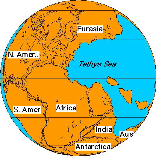
- Tectonic / volcanic forces broke apart the hard surface of this single continent into pieces, called plates, reversing the proportion of surface area of land to sea.
-
The birth of the Rocky Mountains, known as the Laramide Orogeny / mountain building occurred when Pangaea, the last supercontinent began to break apart “in the days of Peleg” about 300 years after Noah’s flood, into geological “plates” that “float” on a viscous layer of lava beneath them. In the maelstrom of tectonic convulsions, the North American plate rebounded and collided with the Pacific-Farallon Plate, and the North American plate was forced upward. These orogenies occurred throughout the world at this time.

-
The Himalayas has some of the Earth’s highest peaks, including the highest, Mount Everest. More than 100 peaks exceeding elevations of 7,200 m (23,600 ft) above sea level.
Check my math. 100 x 23,600 = 2,360,000 feet = ~450 miles in height.

-
There are actually 9,000 ft-high mountains lurking beneath 12,000 feet of ice for a total height of 21,000 feet above sea level, comparable to the tallest exposed mountain above sea level – Mount Everest at 29,000 feet. A group of scientists has mapped the most precise measurements yet of 48 million square / i.e. two dimensional] kilometers / ~24 million square miles of the Antarctic’s) Southern Ocean showing that submerged mountains encircle all of continental Antarctica’s exposed land mass.
-
Including these 24 million square miles lower elevation but still mountainous underwater land mass with the 5,500,000 sq miles continent of Antarctica results in a total mountainous area of roughly 30,000,000 square miles at the South Pole. This is approximately
- 1/7 of earth’s ground area of 200 million square miles.
- and over 100 times larger than the Himalaya’ reported total area of 230,000 square miles.
BUT! This is using these governmental measurements without factoring in the three-dimensional additional heights of Antarctic’s mountains, which are equivalent to the Himalayas.
Imagine you are on the beach competing to build the biggest sandcastle in a competition. You’d need to stake out a big area of flat sand to use for the spectacular height and width of your sandcastle, right?
Same thing here. The maps we have don’t account for where the tectonic forces got enough flat land to shape into Antarctica’s massive extent of mountainous terrain.
Deception #5 – Hiding Antarctica’s Connection To South America
We don’t need an advanced degree in geology to see that Antarctica’s land mass is just as much connected to South America as the Artic is connected to North America’s “surrounding land, including all of Greenland and Spitsbergen, and the northern parts of Alaska, Canada, Norway, and Russia.”
You probably don’t realize it, but virtually every world map you’ve ever seen is wrong.
The Antarctic Circumpolar Current ACC is the only current in the global ocean to close upon itself in a circumpolar loop, ~13,000 mi long, reaching from the ocean’s surface to its deepest bottom while transporting 130 million cubic meters of water per second, it connects the three main ocean basins to the north, thus enabling a truly global circulation. and plays a key role in regulating global climate.
Deception #2 – Hiding Antarctic’s Size Due To Holding A Vast Amount Of Water
“And God said, Let the waters under the heaven be gathered together unto one place,” (Genesis 1:9)
This process didn’t change the amount of land, it just added more vertical to its horizontal dimensions.
Among the most dramatic and visible creations of plate-tectonic forces during Pangea’s breakup are the lofty Himalayas, which were formed when India slammed into Asia with such force that the Himalayas were shoved skyward.
“The Himalayas total area amounts to about 230,000 square miles stretching in length 1,550 miles from west to east, and in width between 125 and 250 miles (200 and 400 km) from north to south.
Whoa! Deceptive!
When I took an RV trip across the Rocky Mountains, driving up and down a surface that is represented only in two dimensions on a map, I very sensibly did not rely on that map to calculate time and gas mileage, but took into account the vertical distance as well.
Likewise, the actual surface area of the Himalayans after it was crumpled by tectonic forces must take into account these vertical distances to recognize its true size as a percentage of the earth’s total surface.
If we include the bare minimum estimate of the height surface area using just the tallest mountains in the Himalayas, that brings us to a low-ball estimate of 103,500,000 square miles of actual surface area for the Himalayas, or about half of an estimated total square miles of surface area of the entire earth at 196,900,000 square miles.
Well, that can’t be right, given all the other mountain ranges across the world as well, so we’re forced to conclude that the data given for this estimated total square miles of surface area of the entire earth is either massively scientifically sloppy or deliberately deceptive to keep something secret.
That would be Antarctica.
Radar imaging applying state of the art techniques to decades of research has revealed what Antarctica (the landmass continent) would really look like if it wasn’t covered in ice – mountainous to the extreme.
But to prove a point, those with advanced degrees in geology have determined that Antarctica and South America share the same geology formed by crustal plate fragments that have been smashed together.
Ergo, West Antarctica is an extension of the vastly longer north-south Cordillera Mountain Range.
So why is it not shown as such on the maps?
-
Deception #6 – Hiding The Fact That Antarctica Can’t Fit On The Outside Of The Earth
-
This is not a conspiracy theory but real deception. While the AuthaGraph continental layout was only published in 2016, it had been drawn with astounding accuracy 70 years earlier as the “ Official Seal and Emblem of the United Nations, Report of the Secretary-General, 15 October 1946″.
-
-
-
-
-
-
-

South America’s elongated northeast projection is the giveaway.
As is 1946. The same year that Admiral Richard Byrd led Operation Highjump into Antarctica.
And Antarctica is not shown at all on the UN map. That is really odd, considering how much trouble the European Powers went through to get their hands on Antarctica.
-
-